
Frugalpac terms and conditions for the purchase of goods

How to Choose Wine Bottle Paper for Packaging

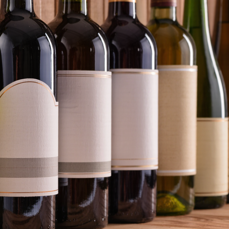
Choosing wine bottle paper is a small decision with a visible impact. It affects shelf appeal, print quality, handling, and how a bottle feels in the hand. A label may look smooth under studio lights, then wrinkle around a bottle’s curve or scuff during transport. The right paper balances appearance with performance.

This guide compares the details that matter: paper weight, texture, opacity, adhesive compatibility, and resistance to moisture and abrasion. A matte stock can soften a rustic design. A coated surface can make fine lettering sharper. Neither is automatically better. Bottle shape, label size, storage conditions, and printing method all influence the result. Test samples on the actual bottle. Check them after chilling, handling, and wiping. Small flaws show quickly.

The phrase “wine bottle paper” can refer to label stock or decorative wrapping paper, and those uses call for different materials. This outline focuses on label paper unless noted otherwise. One reliability note: no source interview or verifiable expert quotation was provided, so I won’t invent a named specialist’s words. Instead, the selection advice should be checked against current supplier specifications and physical samples. Paper descriptions can sound precise; real bottles are less forgiving. A sample that looks perfect on a flat sheet may behave differently on glass. That is worth remembering.
How to Choose Wine Bottle Paper for Packaging

Define the Packaging Requirements for the Wine Bottle

Before choosing wine bottle paper, define the job the packaging must perform. Record the bottle’s height, widest diameter, and filled weight, then check how much space remains around its shoulders and base. A snug fit limits movement, but tight folds can split during packing. Small details matter. Note whether the package will protect one bottle, a pair, or a full case, and whether it will travel by hand, courier, or pallet. Each route creates different pressure, rubbing, and drop risks.

Consider the environment, too. A bottle displayed in a cool shop needs different protection from one handled in a damp cellar or shipped through changing temperatures. If paper may touch condensation, test its surface and seams after exposure; attractive paper can soften faster than expected.

Specify the finish, color, print area, and desired feel, but treat appearance as a requirement alongside strength. Recycled content may suit the project, though fiber quality and stiffness vary. Ask for samples and make a simple wrapped-bottle mock-up. Then check whether it creases cleanly, stays closed, and can be applied at the intended packing speed. A paper specification can look complete on a screen and still miss how a real bottle shifts in transit. We may need to revise it after handling a sample.

Compare Paper Types, Weights, and Surface Finishes

Choosing paper for wine bottle packaging starts with the job it must do. A lightweight, flexible sheet can wrap a bottle neatly, while a heavier stock feels more protective and substantial. Uncoated paper has a natural, tactile surface and takes pencil-like or muted print effects well. Coated paper usually gives images sharper detail, but can feel less organic. Kraft paper adds visible fibers and a rustic tone. It may also show color differently than expected, so check a printed sample.

Weight matters, but heavier is not automatically better. Around 80–120 gsm often suits flexible wraps or sleeves; roughly 150–250 gsm can work for firmer bands, carriers, or presentation packaging. These are starting points, not rules. Bottle shape, folds, adhesive, and handling all change how a sheet performs. Test a wrapped bottle in the hand. Does the paper crease cleanly? Does the edge lift?

Surface finish changes both appearance and use. Matte finishes reduce glare and can make small text easier to read. Gloss finishes bring out rich colors, though scuffs may show under bright light. Embossing adds a raised detail you can feel. Keep it restrained; too much texture can make printing uneven. One detail is easy to miss: moisture from a chilled bottle can soften some papers or affect the finish. Test the actual stock with a cold, lightly damp bottle before choosing. There is no perfect sheet. Real handling may prove your favorite sample wrong.

Assess Bottle Protection and Packaging Compatibility

A wine bottle’s weight and shape should guide the paper choice. A narrow neck, sloped shoulders, and heavy glass create different pressure points during handling. Thin paper may prevent scuffs, but it will not absorb much impact on its own. For extra cushioning, consider layered wrapping or a fitted paper insert that keeps the bottle from shifting.

Fit matters. The package should hold the bottle snugly without pressing hard against the glass. Check that paper folds sit flat around the base and neck, where loose edges can catch or tear. Also consider the outer carton: an insert that fits one box may leave gaps in another. Humidity can soften paper, too, so test samples after storage in realistic conditions. Test both.

A simple trial can reveal problems early. Pack a bottle, gently tilt the box, and inspect for movement, rubbing, or crushed folds. Then repeat with the intended shipping carton and packing materials. I have found that paper can look sturdy on a worktable yet feel too soft after handling. That is an imperfect first impression, but a useful reason to test again. Choose protection based on the full package, not paper thickness alone.

How to Choose Wine Bottle Paper for Packaging

Assess bottle protection and packaging compatibility

Indicative ratings from 1 (low) to 5 (high), based on typical material structure and packaging use—not standardized laboratory test results. Actual performance depends on paper grade, design, fit, and packing conditions. Validate protection with drop and transit testing.

Evaluate Print Quality, Sustainability, and Cost

Print quality starts with the actual paper, not a screen preview. Request a press proof on the proposed stock, then inspect fine text, color shifts, and dark areas under ordinary lighting. Check whether the paper absorbs ink unevenly or scuffs when rubbed. Small details matter.

Sustainability needs evidence. Ask about recycled content, fiber sourcing, and whether coatings or laminations affect local recycling options. A lighter sheet may reduce material use, but it still needs enough strength to resist tearing during packing and transport. Test a wrapped bottle, including around the neck and base. Water droplets can expose weak points. Claims on a supplier sheet are useful, but they do not replace a physical sample.

Cost is more than the price per sheet. Compare print setup, waste, finishing, and the time needed to apply labels or wraps. Heavier paper may cost more but run more reliably; thinner stock can wrinkle and create rework. There is no perfect choice. I would compare two or three samples using the same artwork and handling test, then note the trade-offs before ordering a full run. A simple cost table helps, though estimates can miss production surprises.

Test Paper Options Before Making a Final Selection

A paper sample can look convincing on a flat table and behave very differently around a bottle. Test each option on the actual bottle shape, using the same label size, print coverage, and closure method. Check whether the sheet creases cleanly at the shoulder or forms small wrinkles near the base. Small details matter.

Handle wrapped samples with dry hands, then repeat with slightly damp fingers to mimic condensation during storage. Rub printed areas gently with a clean cloth and look for smudging, scuffs, or color transfer. A paper that feels sturdy may still tear at a fold. Let the samples sit overnight, too; some coatings or adhesives reveal problems only after a delay.

Record the paper weight, texture, finish, and results beside each sample. Photograph the same bottle under consistent lighting, so color comparisons are less subjective. If the packaging will travel, place a wrapped bottle in a box and check for rubbing after a short, controlled movement test. This is not a full shipping trial, and it can miss real-world damage. That limitation is easy to overlook. Test more than one sample from each paper batch, since a single sheet may not represent the whole order. When results conflict, repeat the test before committing.

How to Choose Wine Bottle Paper for Packaging - Test Paper Options Before Making a Final Selection
Paper option Typical basis weight Typical caliper Appearance and print performance Moisture considerations Best suited to Recommended test
Uncoated label paper 80–100 g/m² 90–130 μm Natural, matte surface; works well for a restrained look. Fine details and saturated colors may appear less crisp than on coated stock. Can absorb moisture and may wrinkle or stain unless the paper and label construction are designed for damp conditions. Dry-storage bottles and designs that favor a natural paper feel. Check ink drying, scuffing, and edge lift after applying the label to a curved bottle.
Coated label paper 80–100 g/m² 70–110 μm Smooth surface supports sharp text and consistent color. Available in matte or gloss finishes. The coating can improve surface resistance, but it does not make the complete label waterproof; adhesive and edge performance still matter. Detailed artwork, fine type, and labels requiring a clean, even print surface. Compare print clarity and rub resistance; test the finished label after condensation exposure.
Textured or felt-marked paper 90–120 g/m² 100–180 μm Tactile surface adds visual depth. Very small type, fine lines, and large solid ink areas may print less evenly on pronounced textures. Texture alone does not provide moisture resistance; performance depends on the paper treatment, finish, and adhesive. Premium-feel labels with simple artwork and limited fine detail. Inspect ink coverage on the actual paper surface and check whether the thicker stock conforms to the bottle.
Wet-strength label paper 80–100 g/m² 85–130 μm Often has a smooth or lightly textured finish; print results depend on its surface treatment and the chosen ink system. Formulated to retain more strength when damp than standard paper, but the finished label still needs a compatible moisture-resistant adhesive. Bottles likely to encounter chilling, condensation, or brief contact with water. Run a chilled-bottle test and check for lifting, tearing, ink transfer, and surface damage.
Metallized paper 80–100 g/m² 70–110 μm Reflective finish creates a bright, high-impact effect. Metallic appearance and color depend on print coverage and finishing methods. A metallic surface is not, by itself, proof of water resistance. Confirm the stock construction and adhesive are suitable for the intended conditions. Accents, decorative details, or designs intended to stand out on the shelf. Review a printed sample under store lighting and test adhesion, scuffing, and condensation performance.
Selection note: Basis weight and caliper are typical ranges, not guaranteed specifications; they vary by grade and supplier. Before final selection, request samples, confirm compatibility with the printing process and adhesive, and test labels on the actual bottle under expected storage, chilling, and handling conditions.
Close