Top Tips for Selecting the Best Paper Wine Labels
When it comes to marketing your wine, details matter. One crucial element is the label. Paper wine labels can greatly influence a consumer's choice. A well-designed label enhances your brand's image and makes your product stand out. Quality paper wine labels are essential for conveying the right message about your wine.
Choosing the right paper can be challenging. Each type offers unique benefits. For instance, textured labels can add a touch of elegance. On the other hand, waterproof options can be practical for outdoor events. Finding a balance between aesthetics and functionality is key.
Not everyone understands the complexities involved in label selection. It is easy to overlook aspects like durability or print quality. This can lead to potential setbacks in branding. Reflecting on your choices and understanding your product’s needs will guide you. Making informed decisions in paper wine labels can create lasting impressions and drive sales.
Understanding Different Types of Paper Wine Labels and Their Uses
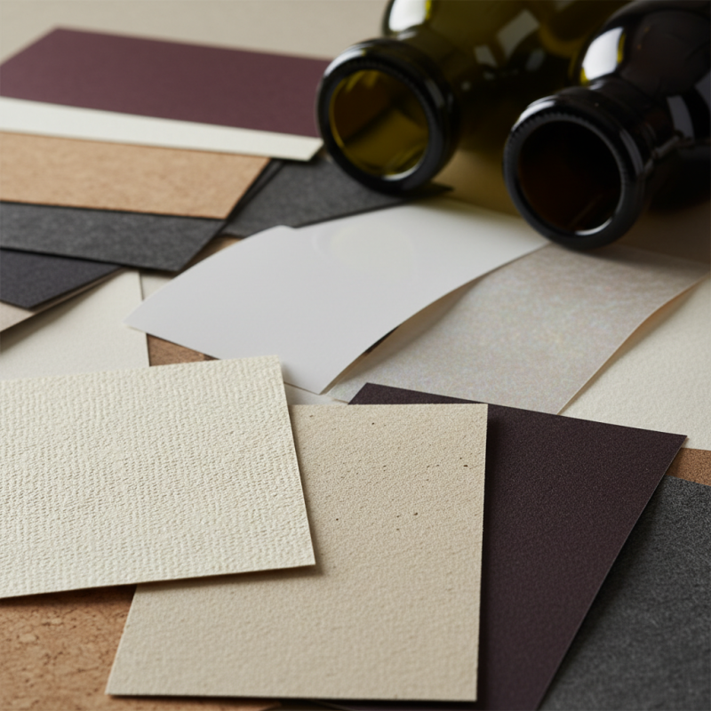
When selecting paper wine labels, understanding the different types is vital. Each type serves a specific purpose and impacts the overall appeal of your wine. For instance, uncoated paper labels are popular for a rustic look. They absorb ink well and allow for vibrant designs. However, they may not withstand moisture as effectively as coated options.
Coated paper labels offer durability and a sleek finish. These labels resist water and smudging. They are ideal for wines stored in humid conditions. Yet, the glossy surface may limit certain printing techniques, which could change how designs look.
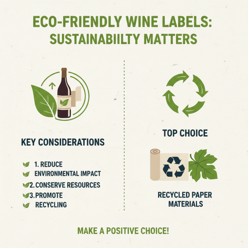
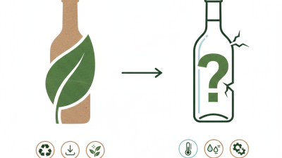
Sustainable paper options are emerging, gaining popularity among eco-conscious producers. These labels maintain quality while reducing environmental impact.
Choosing the right paper wine label requires careful thought. Assess your brand's identity and how the label aligns with it. A well-selected label reflects the quality of the wine itself. Test samples to see how they hold up over time. Not all choices will resonate with your target audience, so gather feedback. This can lead to a more informed decision, ultimately improving your product's marketability.
Key Factors to Consider When Choosing Paper for Wine Labels
When selecting paper for wine labels, it’s crucial to consider specific factors that can affect appearance and durability. The texture and finish of the paper play significant roles in how the label presents your product. A smooth finish can enhance vibrant colors, while a textured paper may add a rustic touch, aligning with your brand’s identity.
Tips: Choose papers that are moisture-resistant, especially if the bottles will be stored in cool or humid environments. Non-tearable options are also ideal, as they ensure the label remains intact, preserving the wine's aesthetic. Consider the weight of the paper; heavier stocks often feel more luxurious.
It's important to test different papers before making a final decision. Not all papers respond the same way to print, so running a few test prints is wise. Colors may appear darker or lighter, depending on the paper used. Exploring options allows you to reflect on how each choice aligns with your brand's story.
Design Elements that Enhance the Appeal of Paper Wine Labels
When selecting paper wine labels, design elements play a crucial role. Use colors that reflect the wine's character and origin. A deep red can indicate richness, while a crisp green suggests freshness. Fonts also matter. Choose a typeface that conveys the overall tone of the wine. A classic serif font may evoke tradition, while a modern sans-serif can feel more contemporary.
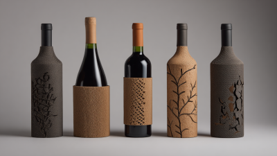
Texture adds another layer to the label's appeal. Consider using a matte finish for an elegant touch. Alternatively, a glossy sheen can enhance vibrant colors. Don't forget about imagery. A well-chosen graphic can tell a story or represent the vineyard’s heritage. However, too much detail can overwhelm the viewer, leading to confusion. Striking the right balance is essential.
Keep in mind that simplicity often enhances recognition. A clean design allows the consumer to focus on the wine itself. Oversized labels or complex elements can distract and lose potential customers. Regularly seeking feedback on designs can illuminate what resonates with the audience. This iterative process helps refine your approach. Ultimately, thoughtful design elements can elevate your paper wine labels and attract attention on crowded shelves.
Top Tips for Selecting the Best Paper Wine Labels - Design Elements that Enhance the Appeal of Paper Wine Labels
| Design Element |
Description |
Importance |
| Material Quality |
Using high-quality paper that is durable and resistant to moisture. |
Ensures longevity and maintains a premium look. |
| Color Scheme |
Choosing colors that represent the wine's flavor profile and brand identity. |
Attracts customers and enhances brand recognition. |
| Typography |
Selecting fonts that are legible and reflect the wine's personality. |
Improves readability and sets the tone of the product. |
| Graphic Elements |
Incorporating illustrations or icons that tell a story about the wine. |
Creates emotional connections and attracts attention. |
| Finish Type |
Using matte or glossy finishes to enhance visual appeal. |
Affects tactile experience and overall impression. |
Printing Options and Techniques for Stunning Wine Labels
When creating stunning wine labels, the choice of printing options and techniques plays a critical role. High-quality materials enhance design elements, making your labels stand out. Consider options like matte or glossy finishes. Matte often exudes elegance, while glossy can create vibrant color depth. Each choice significantly alters perception.
Using digital printing is also a wise choice. It offers flexibility and quick turnaround times. Custom sizes and shapes can be easily achieved. However, it's essential to ensure that the ink adheres well to the label material. Inconsistent ink quality can lead to smudges or fading. This attention to detail is vital for a professional look.
Don’t overlook the importance of texture. Embossing or debossing can add a tactile element to your labels. This invites touch and creates a memorable experience. Nevertheless, extra layers might increase production costs. Balancing aesthetics and budget is always a challenge. Each choice impacts your overall design, so weigh your options carefully.